
2026-11-14 · Watches And More
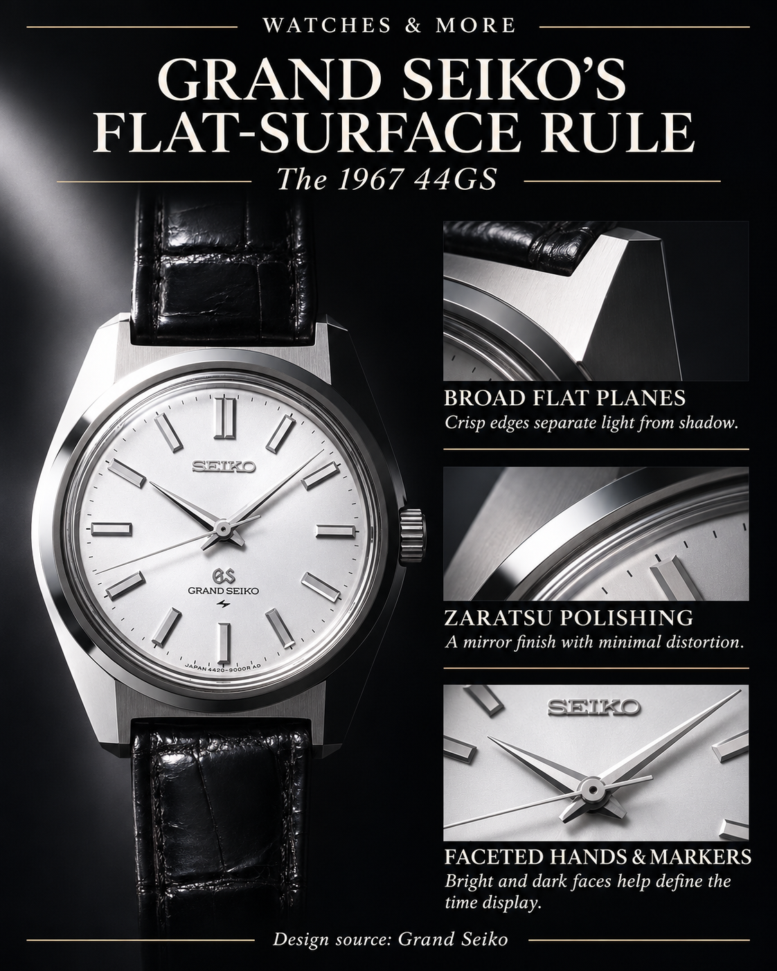
Start with the surface, not the movement. Grand Seiko’s own explanation of its style puts straight lines and flat planes at the center of an interplay between light and shadow. Two of its documented principles make the instruction especially concrete: give the case, dial and hands broad flat areas, and pursue distortion-free mirror surfaces. [S1] [S1] [S1]
💡 Did You Know?
Grand Seiko identifies the 1967 44GS as the watch that established this design vocabulary. Its account describes a flat front surface given a distortion-free finish through Zaratsu polishing, with multifaceted hands and indexes allowing light to play across the dial. The geometry was not confined to the case: the same visual idea reached into the time display. [S1] [S1] [S1]
There is a useful qualification in the rulebook: three-dimensional curves are generally avoided, not absolutely forbidden. Grand Seiko also describes a smoothly curved case edge that softens sharp angles. Flatness is the emphasis, rather than a demand that every contour become a straight line. [S1] [S1]
🎬 Watch the YouTube Short · Why Does This Grand Seiko Turn Black When You Tilt It? See how a slight tilt changes the reflections on the 1967 Grand Seiko 44GS.
⭐ Why It Matters
In the manufacturer’s explanation, brilliance and readability belong to the same design problem. Grand Seiko says flat areas and multifaceted lines heighten contrast and increase legibility. Its 44GS collection description likewise connects a flat dial and a wider 12 o’clock marker with brilliance and legibility. These are the brand’s stated design intentions, not an independent performance assessment. [S1] [S2]
❤️ The W&M Take
For us, the compelling idea is that a watch’s character can live in its surfaces as much as its silhouette. We think this rulebook offers a rewarding way to look at design: follow a plane, notice its boundary, then consider the contrast beside it. Sparkle becomes a design question rather than merely an adjective.
Sources
- The Grand Seiko Style. Eternal values and a uniquely Japanese sense of beauty
- 44GS | Grand Seiko Heritage Collection
Disclaimer: Every effort has been made to keep these watch facts accurate, but the world of horology is full of myths, disputed stories, and fascinating trivia. Consider these facts a starting point for discovery rather than the final word. If you have corrections or additional insights, let us know—we’re always happy to keep the record ticking in the right direction.
Read Next
- The Spring Drive’s 28-Year Obstacle Course to Reality
- The Seiko Turtle’s Surprising Hollywood Star Turn
Watches And More · Watch Fact Archive · Companion site
Which catches your attention first in a watch design: the dial layout, the case silhouette, or the way its surfaces catch the light?

